


UM Housing
UI/UX Content and Website Redesign


Timeline
AUG 2024 - MAY 2025
Surveys
01.03.

Role

UX Consultant
Tools
Figma
Client Context
Michigan Housing is the University of Michigan’s residential system, providing a variety of living options—from residence halls to apartments—for students, faculty, and families across campus.
⋆My Story: The Spark for this Project
⋆Problem
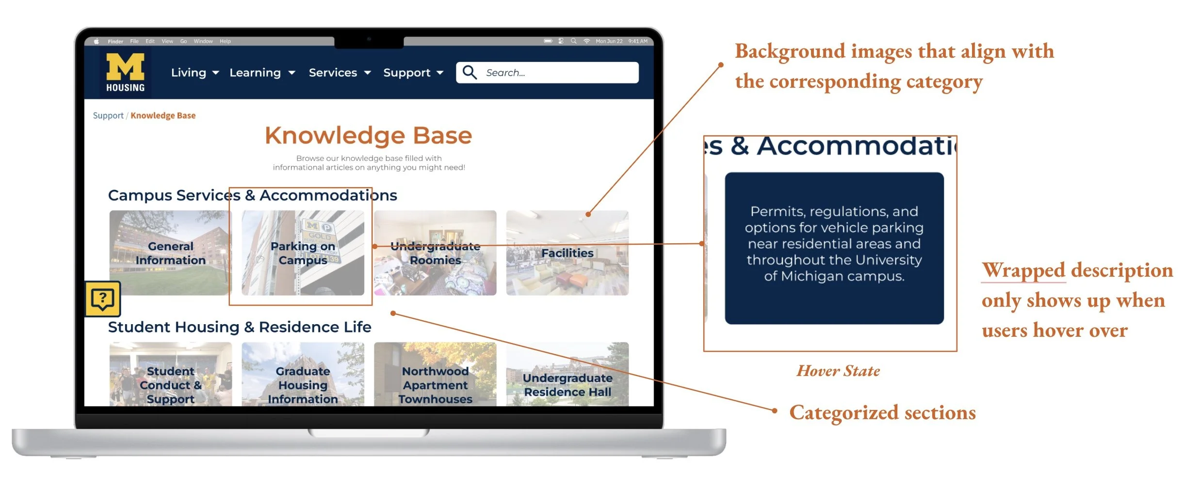
Visual Assistance and Information Wrapping
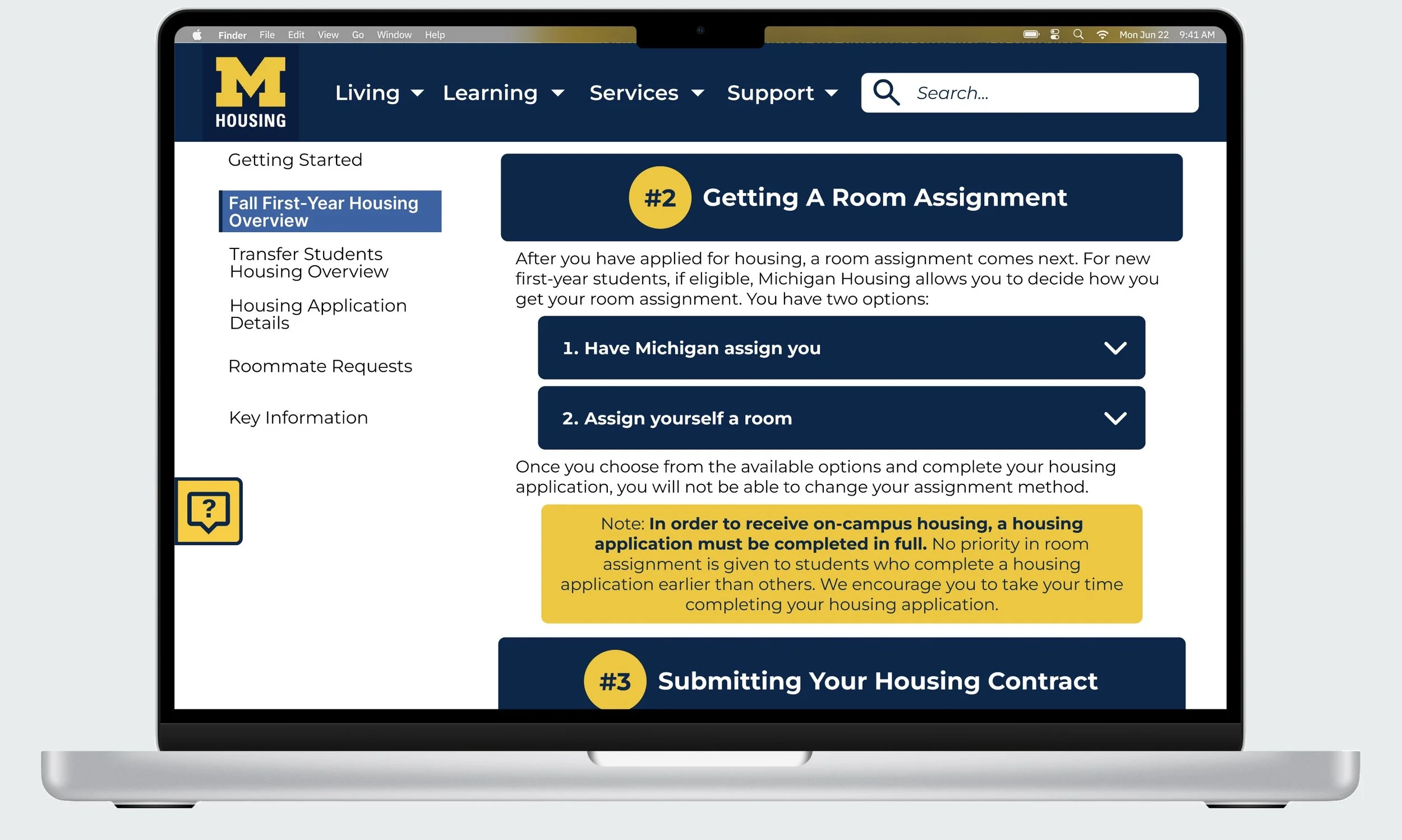
Organized and categorized sections. To reduce clutter, we prototyped the description of each topic to only show when users hover over it.
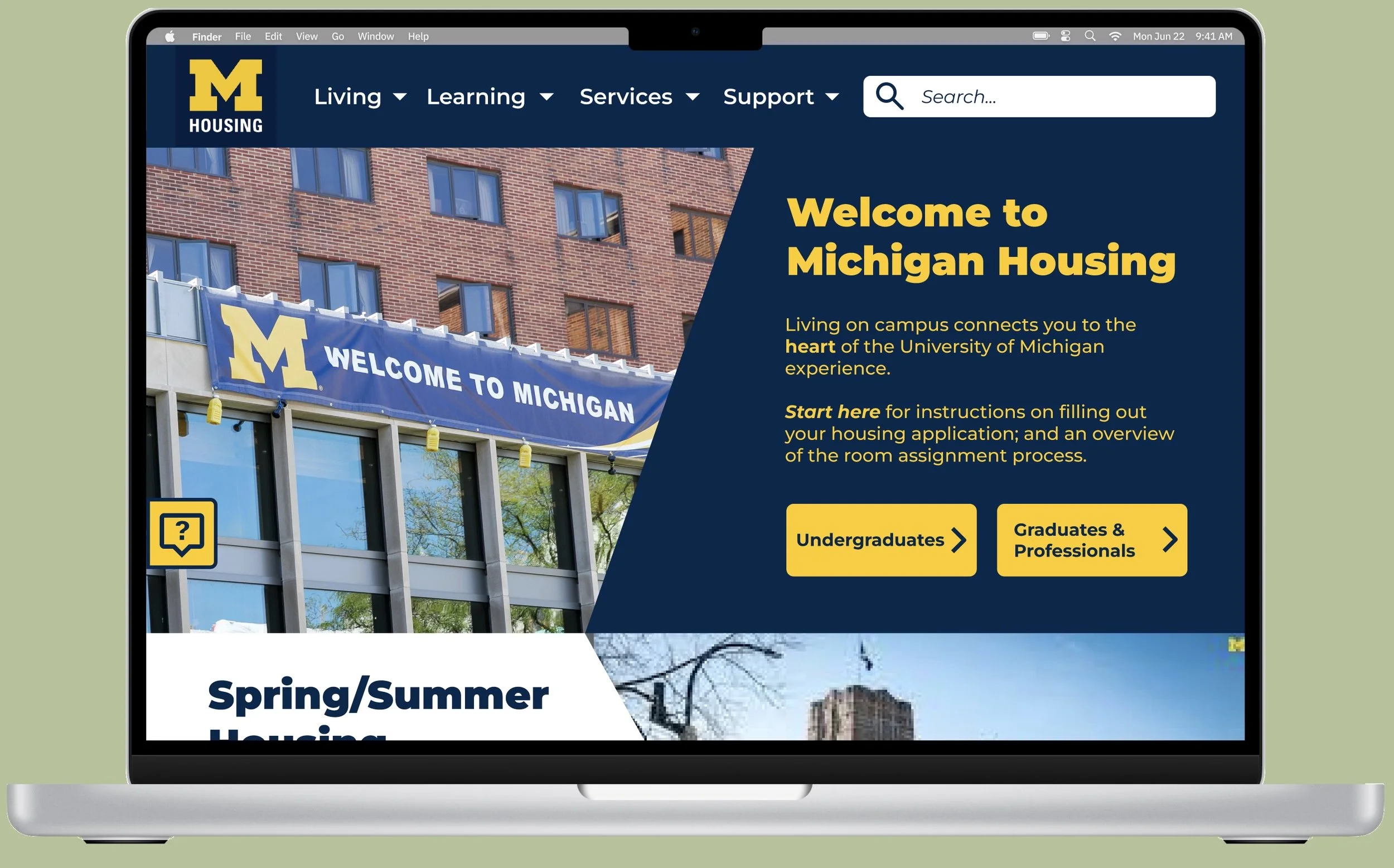
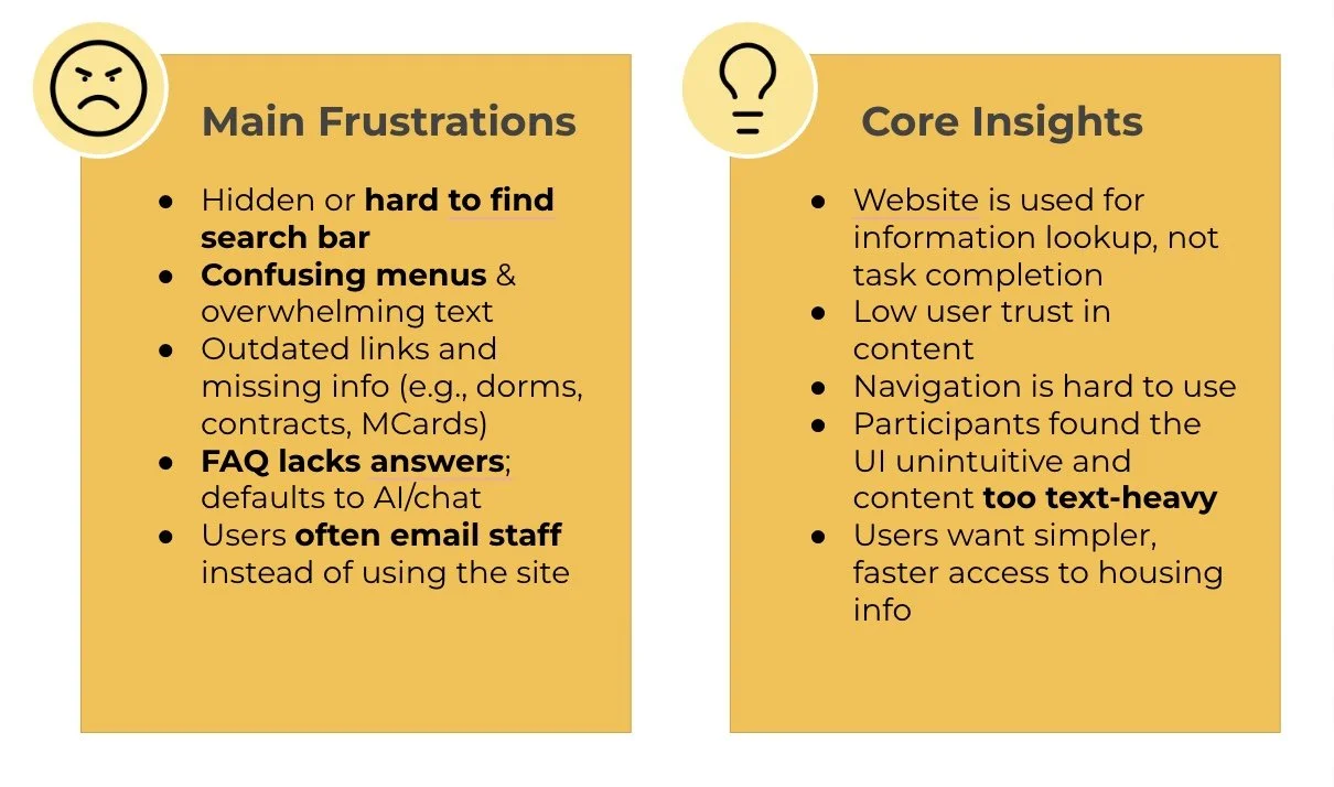
The current Michigan Housing website has a complex structure and uses specialized terminology, making it difficult for a diverse user base to find information efficiently. This has led to a high volume of inquiries, overwhelming staff and frustrating users.
The M Housing website's unintuitive navigation and unclear information presentation hinder users from accessing the information they need, reducing overall efficiency and satisfaction.
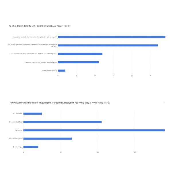
We worked together with Michigan Housing to better understand the challenges from both sides. Our methods included:
We partnered with Michigan Housing to better understand the challenges from both sides. Our total participants were:
Surveys (150+ responses)
User Interviews (12 participants)
Usability Testing (12 sessions)
⋆Our Solution
⋆Our Process
User Interviews
⋆Video Runthrough
⋆Reflection
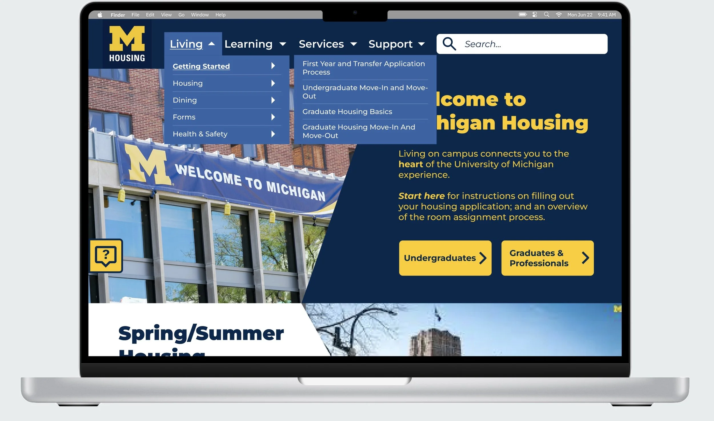
Simplifying Navigation
Consolidated multi-layer menus into a single, predictable navigation bar with an always-visible search function.
User Testing
Team
02.Clarifying Content
Reduced jargon and reorganized pages so important details are visually chunked and easier to scan.
This project was especially meaningful because it started with my own struggles as an incoming student. Experiencing both the user’s frustration and the staff’s workload challenges gave me a unique perspective on the problem.
Working with Michigan Housing taught me how design decisions ripple across entire systems—affecting not only the user interface but also team operations, workload, and service quality. It reinforced the value of clear communication, empathy-driven research, and collaboration with stakeholders to create solutions that serve both users and staff.
Most importantly, it reminded me why I love design!!! - the ability to transform a frustrating, time-consuming process into something simple, supportive, and empowering.
Me as a happy incoming student

Jenn Kim, Phoebe Oh, Selina Zhen, Jesalyn Lieu
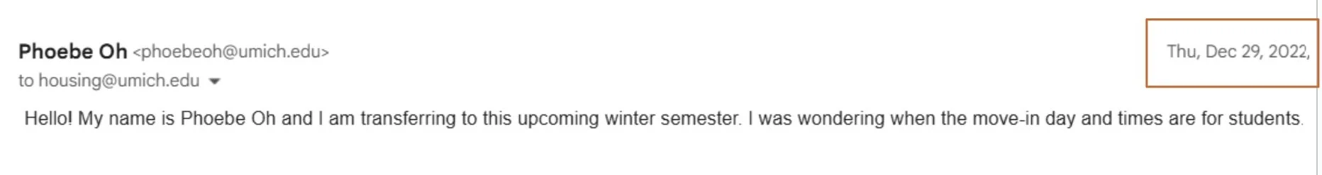
My interest in this project began with my own experience as an incoming UMich student. After applying for housing in November 2022, I struggled to find clear next steps on the Michigan Housing website.
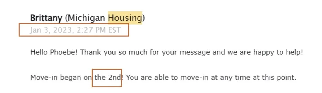
When I emailed for help, I was told to call, which meant waiting in phone queues for the Housing team to answer my questions directly. Later, I sent another email on December 29, but I didn’t receive a reply until January 3—after move-in had already started on January 2.
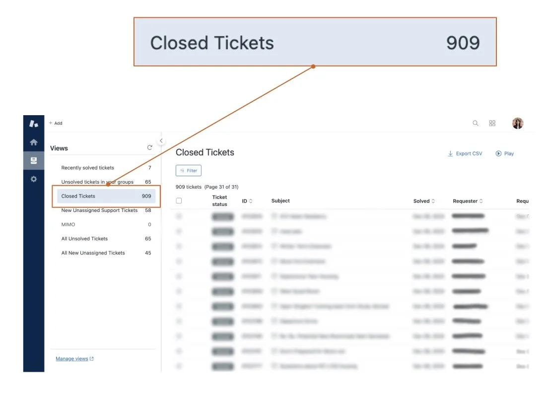
In a span of three months, staff closed over 900 Zendesk tickets, many for questions that could have been answered through a clearer, better-structured website. This not only delayed responses for urgent cases but also reduced satisfaction for both users and staff.
This wasn’t anyone’s fault—rather, it was the reality of a manual, high-volume communication process that had to handle hundreds of similar inquiries.
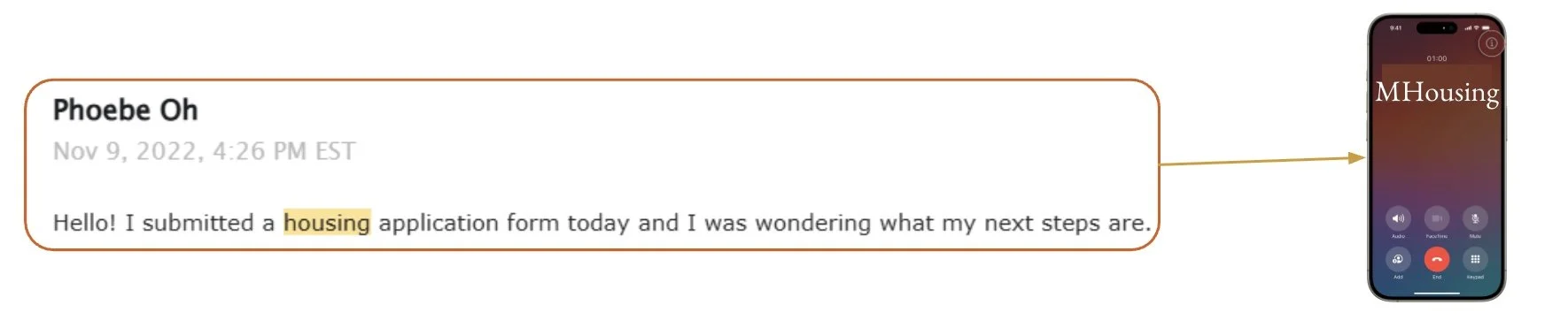
“Hello! I submitted a housing application form today and I was wondering what my next steps are.”
“Hello! My name is Phoebe Oh and I am a student this upcoming winter semester. I was wondering when the move in day and times are for students”
We also organized user interview ideas into central themes, informing our focus areas for addressing key challenges!
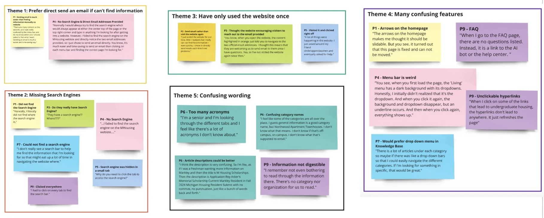
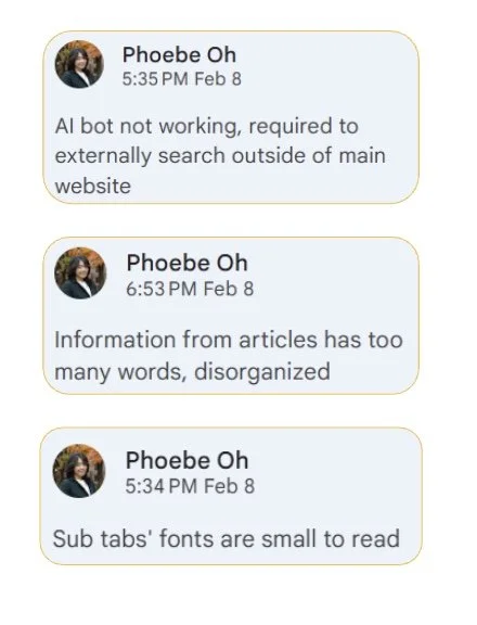
Some Key Insights and Feature Frustrations
Our redesign focused on:
Client List
UX Designer, 2023
Ann Arbor SPARK
UX and Brand Designer, 2024
NOAA Glansis
Design Lead
MHacks