


Wafflr
UI/UX Content and Chemical Structure Search Tool Redesign


Timeline
MAY 2025 - AUG 2025
1. 

Role

Content/UX Design Intern
Tools
Figma
Client Context
Porta Sophia is a prior art library focused on psychedelic-related patents. Their business goals include raising awareness of educational resources and showcasing the tools available to support scientists and researchers. One of their tools is the chemical structure search tool, which allows researchers or scientists to explore substituents, scaffolds, and related patents.
Project Overview - Chemical Structure Tool
⋆Challenge
Stakeholder and user feedback revealed consistent content-related and information architecture pain points:
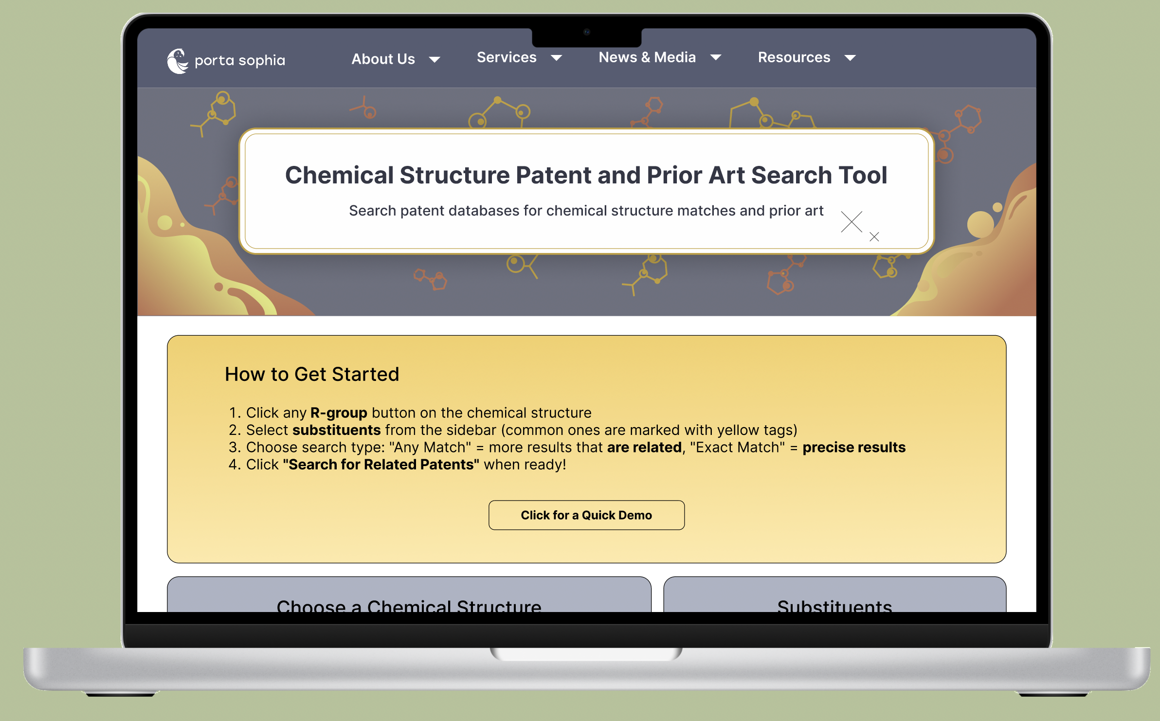
Unclear How to Get Started
Users weren’t sure what the first step was.
No visible instructions or onboarding.
2. Search Filter Confusion
Ambiguity in the supporting text
Step descriptions lacked clarity, leaving users
unsure of what action to take.
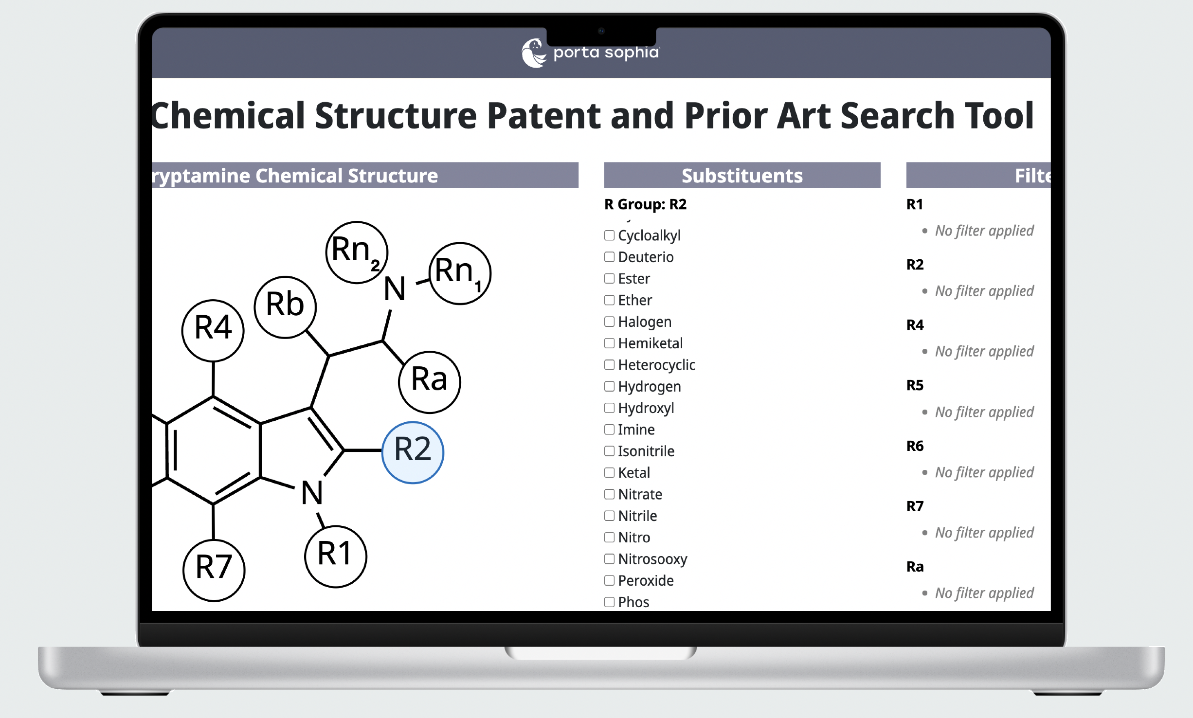
3. Poor Substituent Access
Basic options (like hydrogen) were buried in menus.
🧑🏻: “I found it initially unclear how to begin a search. There are no visual instructions anywhere”
👩🏾🦱: “Unclear which terms are being 'ANDed' or 'ORed.”
👱🏽♂️: “There a lot of substituents listed, and it’s hard to find the specific one I want to select.”
Heuristic Evaluation
⋆Solution
Added a “How to Get Started” guide with 4 steps + a “Quick Demo” button. Used plain, action-driven microcopy (“Click an R-group button → Select substituents → Choose search type → Search”). Bolding important words so it’s easier to scan.
⋆Reflection
No instructions, so users didn’t know how to begin a search.
Active Filters were displayed in the same row as substituents and the chemical structure, which made the interface feel crowded and hard to scan.
Users struggled to understand the search logic and what results their choices would return. (i.e. ANDed or ORed).
This project reinforced for me that good UX writing is functional design. Coming from a non-scientific background, I found it especially rewarding to create an interface that worked for both expert chemists and broader audiences. By structuring instructions, clarifying search logic, and surfacing common actions, I didn’t just polish the interface, but I also reshaped how users approach chemical search altogether.
In complex scientific tools, content is interaction. Without clear, accessible instructions, even the most powerful algorithms remain out of reach.
During my Content/UX internship, I led the end-to-end design of a chemical search tool. Although the core functionality existed when I joined, users had a hard time using the tool. I redesigned the content and interface to create a more approachable, transparent, and effective tool for both professional chemists and aspiring scientists.
⋆Key Issues to Address
2.I reorganized the layout by moving Active Filters beneath the structure. This separated interactive selections from reference elements, reducing visual clutter and making the workflow easier to follow.
✅ Clearer logic: User testing showed a 40% decrease in misinterpreting search settings and 33% decrease in error clicks.
✅ Faster selection: Common substituents surfaced at the top saved ~30 seconds per search flow.
✅ Stakeholder alignment: Demonstrated how content design decisions directly address user confusion.
Using the data I’ve gotten from my user interviews, I was able to analyze the search tool in a user-centric perspective and visually laid out the heurstic evaluation of the tool
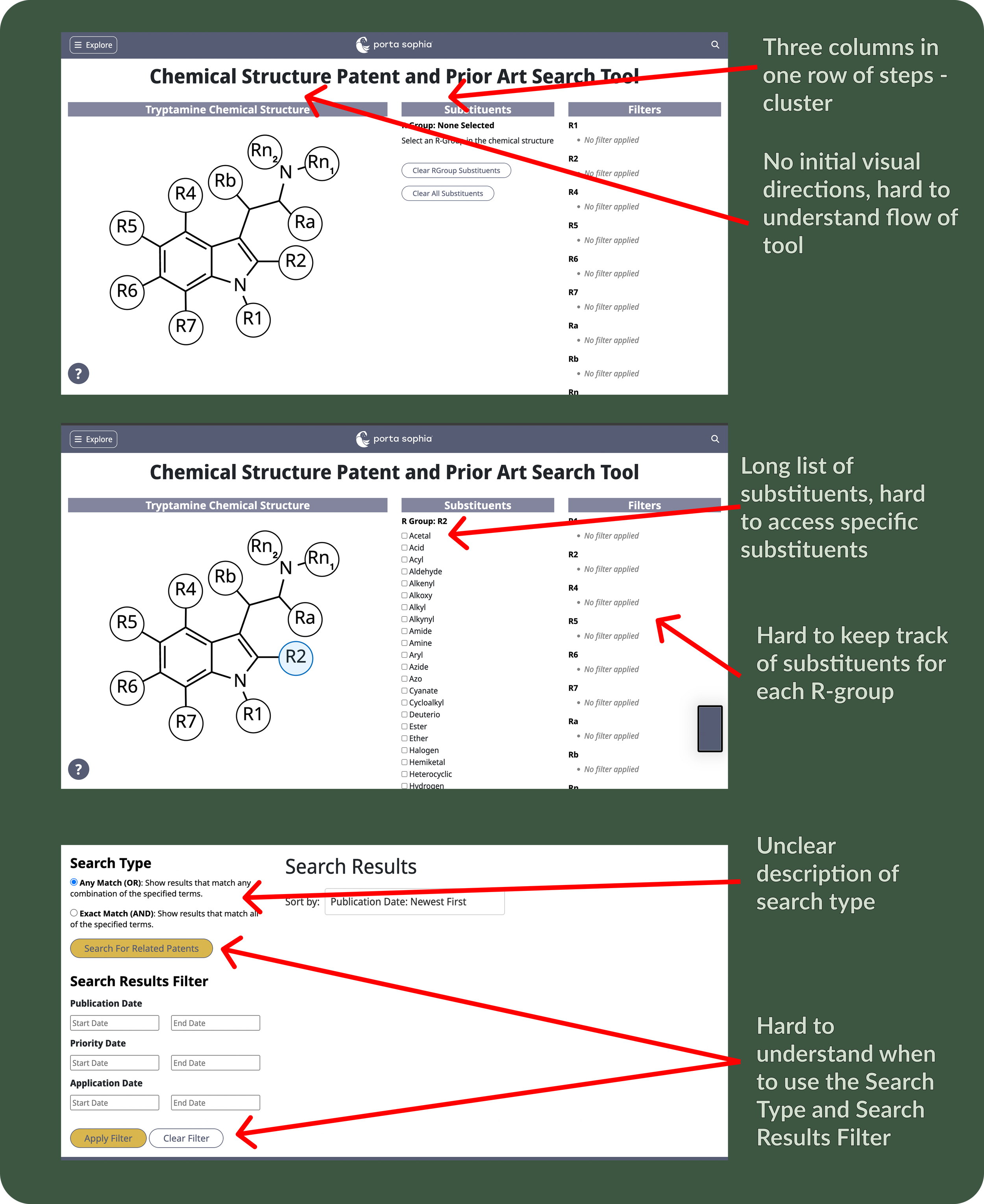
3.Rewrote labels with inline explanations (e.g., “Any Match (OR) → more results, broader search”). Clearly sectioned the “Search Configuration” filter and “Date” filter to reduce flow confusion.
⋆Outcome
Client List
UX Designer, 2023
Ann Arbor SPARK
UX and Brand Designer, 2024
NOAA Glansis
Design Lead
MHacks