


Promega - Porta Sophia
UI/UX Content and Chemical Structure Search Tool Redesign


Timeline
MAY 2025 - AUG 2025
⋆PROJECT STAGES

1. 🌹 Rose - Stakeholder Collaboration
Cross-functional teamwork with researchers, PMs, and engineers was crucial.
Each stakeholder’s perspective enriched the redesign and ensured alignment and taught me so much about cross-functional work.


Role

Content/UX Design Intern
⋆My Input
Gathered stakeholder and user feedback to surface pain points
Conducted a heuristic review of the interface and IA
Developed structured onboarding and microcopy
Designed clear labels, messaging hierarchy, and layout updates
Mocked up “Quick Demo” flow and “How to Get Started” guidance
Collaborated with design, software engineering, and research teams to finalize the interface
⋆5W + 1H (Framing the Problem)
⋆Research - User Interviews
Tools
Figma (wireframing & UX Design)
Client Context
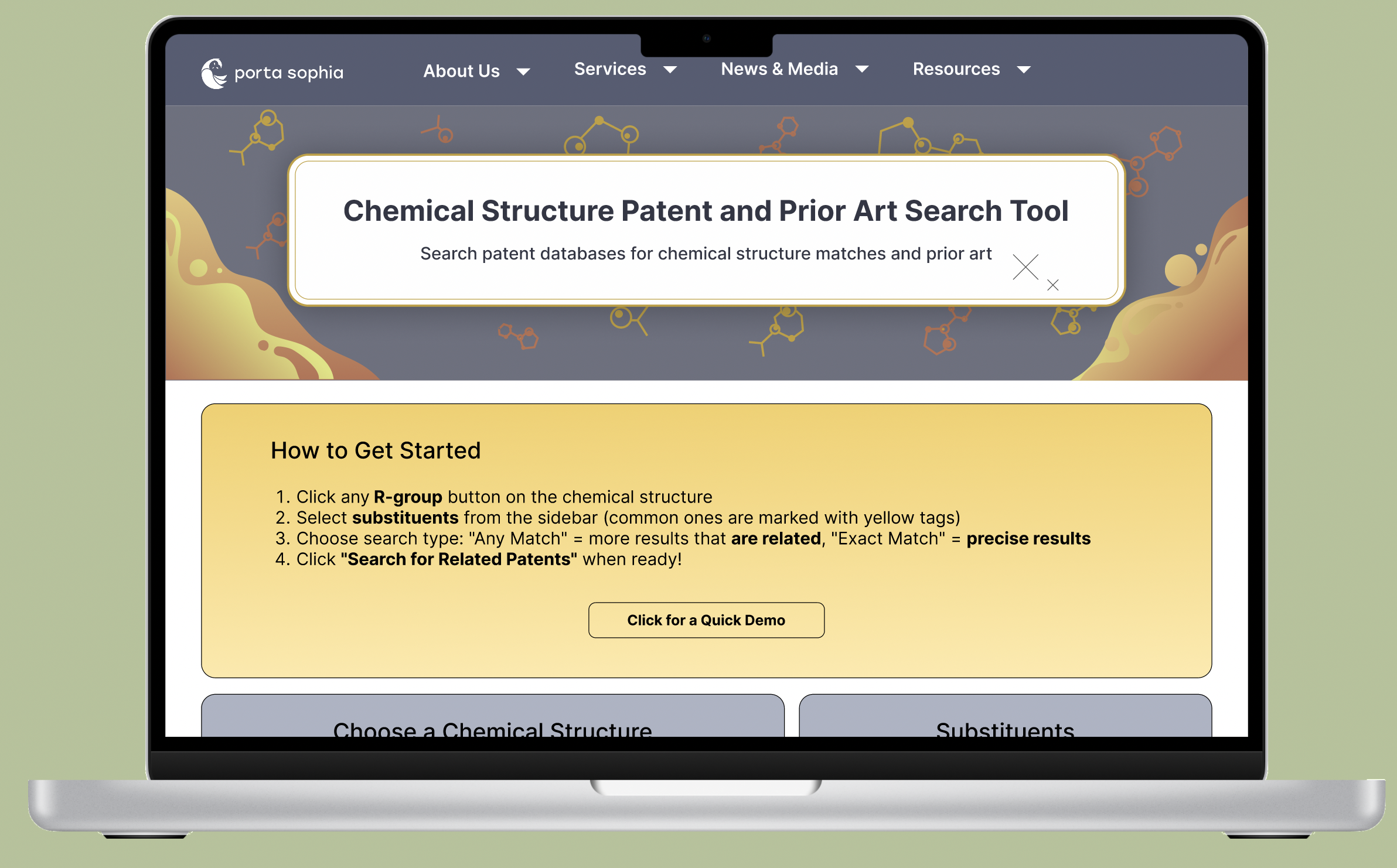
Porta Sophia is a prior art library focused on psychedelic-related patents. The search tool enables researchers to explore substituents, scaffolds, and related patents, but at the time, poor onboarding, ambiguous filters, and limited visibility of options created friction for users. This impacted user engagement and the overall utility of the platform.

Project Overview
UX designers and Product Managers at Porta Sophia
Researchers, scientists, and educator users
Reviewers familiar with patent workflows

Who: Primary users were scientists, researchers, and patent examiners
What: They needed to search for chemical structures and related substituents within Porta Sophia’s psychedelic prior art library.
Where: On the chemical structure search tool interface (main entry point for research workflows)
When: Especially critical during the initial exploration phase of research or when validating novelty for patents
Why: Current inferface created friction. Porta Sophia’s mission depends on making prior art discoverable. If users cannot easily search chemical structures, the platform loses impact and trust.
How: Users struggled through trial-and-error, unclear filter logic, and buried options. This would waste users’ times or lead them to abandon searches altogether.
Stakeholder and user feedback revealed consistent content-related and information architecture pain points:
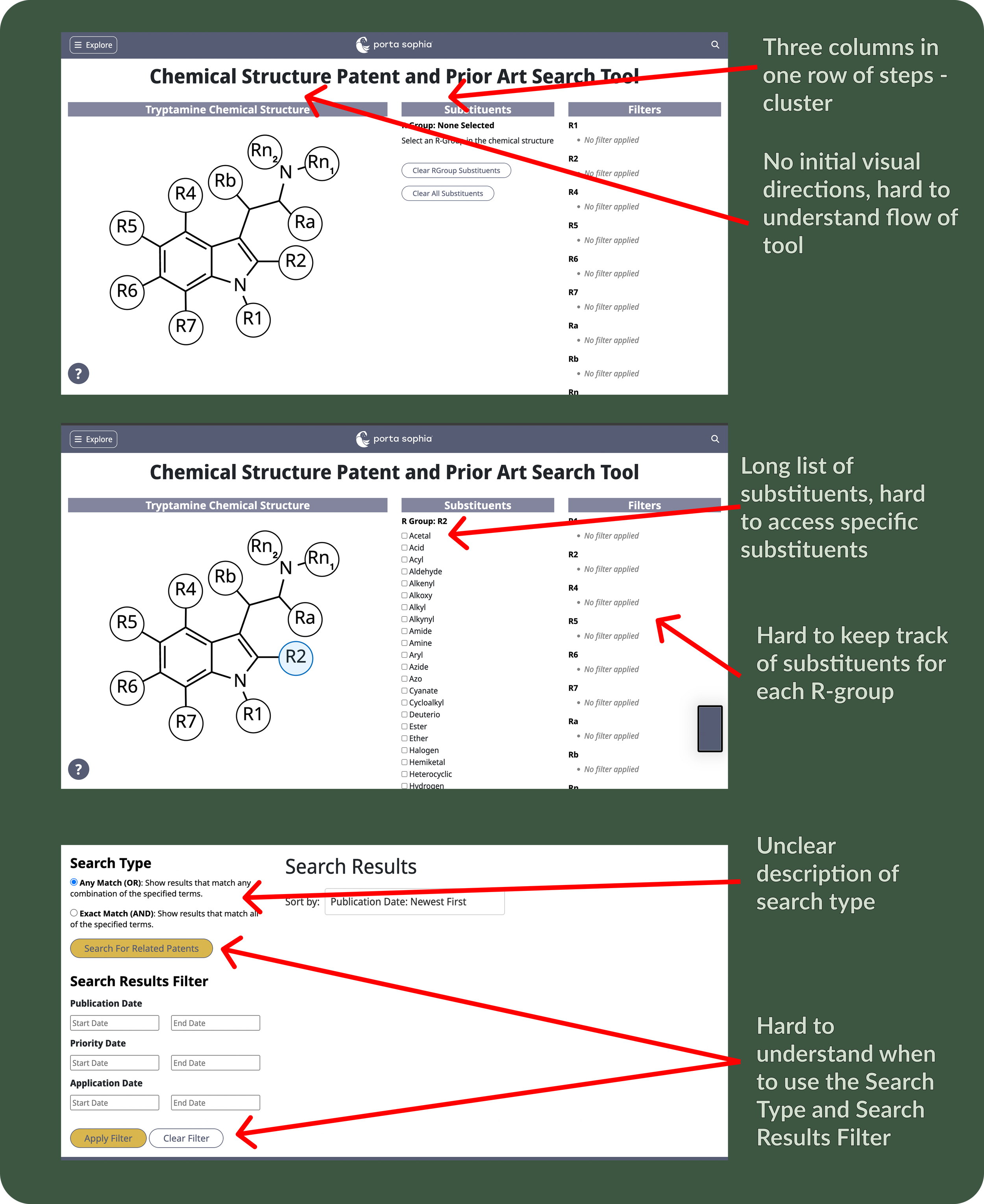
No clear starting point
Users weren’t sure what the first step was.
No visible instructions or onboarding.
2. Filter logic confusion
Ambiguity in the supporting text
Step descriptions lacked clarity, leaving users
unsure of what action to take.
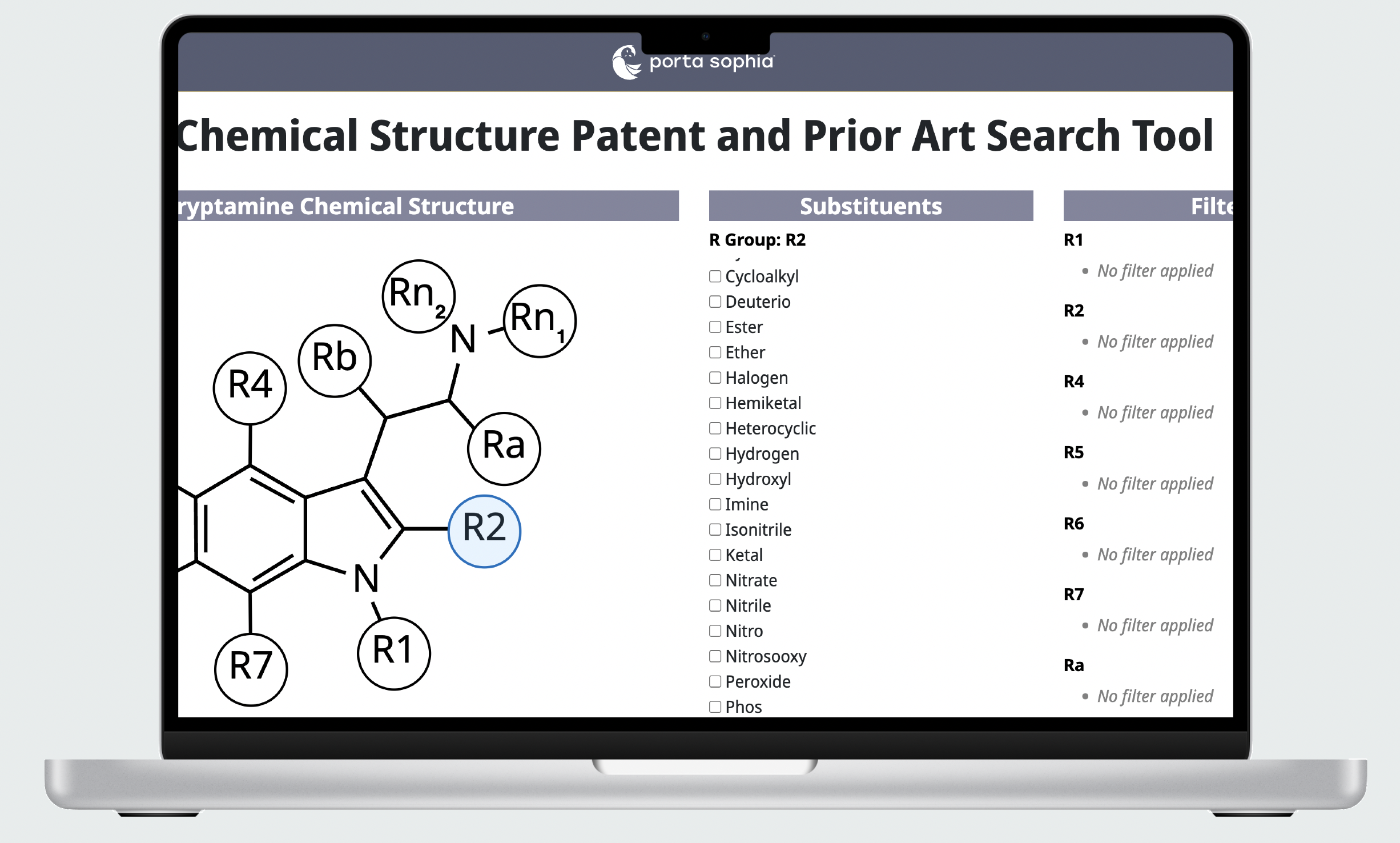
3. Hard to find substituents
Basic options (like hydrogen) were buried in menus.
🧑🏻: “I found it initially unclear how to begin a search. There are no visual instructions anywhere”
👩🏾🦱: “Unclear which terms are being 'ANDed' or 'ORed.”
👱🏽♂️: “There a lot of substituents listed, and it’s hard to find the specific one I want to select.”
⋆Research - Heuristic Evaluations
⋆ Final Solution and Decisions
Added a “How to Get Started” guide with 4 steps + a “Quick Demo” button. Used plain, action-driven microcopy (“Click an R-group button → Select substituents → Choose search type → Search”). Bolding important words so it’s easier to scan.
⋆Reflection


This project reinforced for me that collaboration with stakeholders was crucial to this project. Working closely with researchers and scientists helped me understand the nuances of chemical structure search, while feedback from product managers and engineers grounded my designs in feasibility. Each perspective brought clarity: researchers highlighted usability pain points, PMs ensured alignment with Porta Sophia’s goals, and engineers revealed technical constraints that shaped what could realistically be built.
🌱 Bud - Future Development
Looking forward to the final launch of the tool after QA testing.
Potential to expand the tool for broader scientific communities beyond psychedelics.
Although the core functionality existed when I joined, users had a hard time using the tool. I redesigned the content and interface to create a more approachable, transparent, and effective tool for both professional chemists and aspiring scientists.
⋆Lo-Fidelity
Early wireframe focusing on the layout of search logic, filter placement, and ‘How to Get Started.
⋆Key Issues and Prioritizations to Address
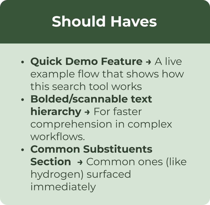
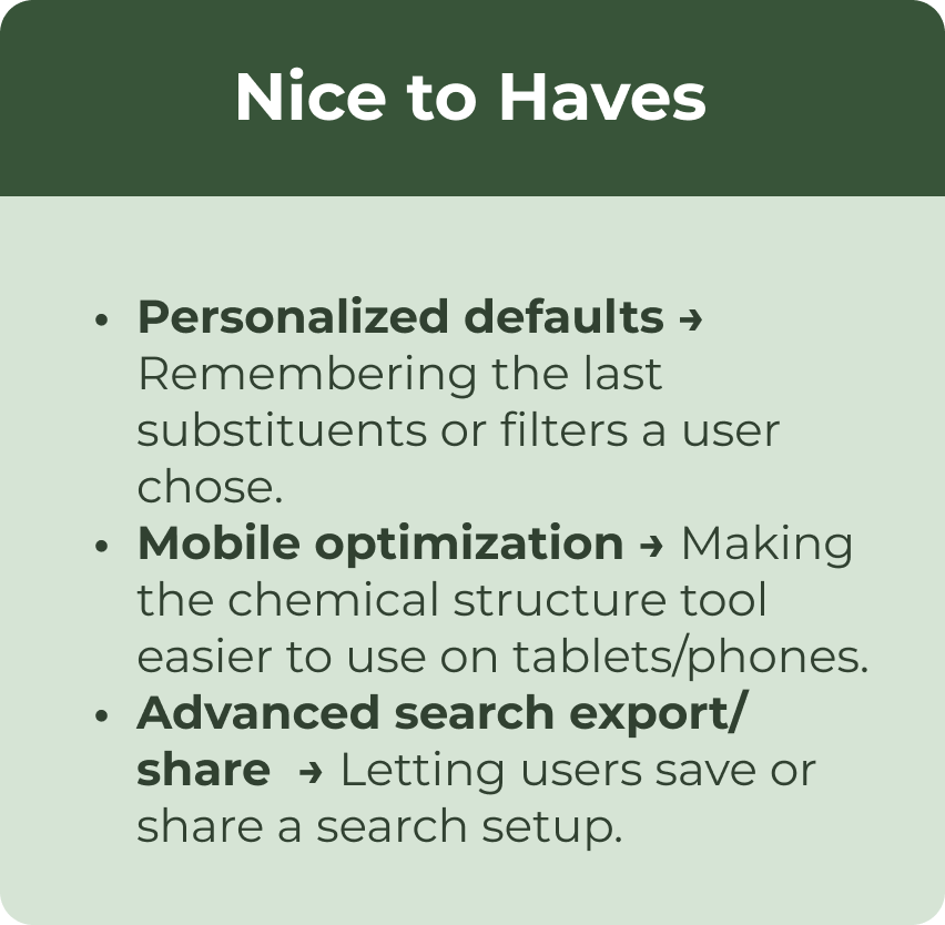
2.🥀 Thorn - MoSCoW Prioritization
Some “Should-haves” weren’t feasible due to technical constraints.
Next time, I’d co-create the prioritization list with PMs and engineers earlier.
I reorganized the layout by moving Active Filters beneath the structure. This separated interactive selections from reference elements, reducing visual clutter and making the workflow easier to follow.
✅ Clearer logic: User testing showed a 33% decrease in error clicks.
✅ Faster selection: Search bar and onboarding directions for selecting substituents saved ~25 seconds per search flow.
✅ Stakeholder alignment: Demonstrated how content design decisions directly address user confusion.
Using the data I’ve gotten from my user interviews, I was able to analyze the search tool in a user-centric perspective and visually laid out the heurstic evaluation of the tool
3.Rewrote labels with inline explanations (e.g., “Any Match (OR) → more results, broader search”). Clearly sectioned the “Search Configuration” filter and “Date” filter to reduce flow confusion.
⋆Outcome
⋆PROJECT STAKEHOLDERS
Client List
UX Designer, 2023
Ann Arbor SPARK
UX and Brand Designer, 2024
NOAA Glansis
Design Lead
MHacks